
MONEY APP
2019
Solving the financial problems of recent-grad students.
FINANCIAL FREEDOM
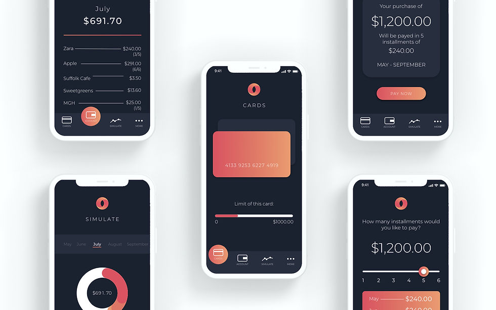
Upon moving to the US, I quickly learned the shopping experience was much different from Brazil, my home country. This app, designed while I was in University, was developed to try to bring some of our concepts to an American public, with visuals and flows that suit the new generation.
THE PROBLEM
I noticed in the US, more precisely among students, people tend to take longer to purchase expensive goods and invest in good quality devices, while banks in Brazil facilitate that by landing small loans and collecting the payment in monthly installments.
When I decided to design an app to tackle this financial issue, I realized my biggest problem was to do it in a way that would make the user comfortable enough to make a small debt with every big purchase, so the shopping experience would become more enjoyable, instead of more stressful.
THE PROCESS
1. Finding a persona
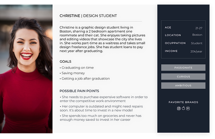
This project was made during one of my classes in univeristy, so I wanted to focus on the people who, along side me, were in a position of not much financial independence, but had big goals to happen in a near future. Our persona was born:
The senior student approaching graduation.
2. Mapping the user experience
During user research, and after drawing a user flow for the app experience, I could analyze the pain-points that could result in frustrations and/or lack of trust in the process. From the user map and research, and later user testing, I developed patterns that, when used on the app design, allowed for the user to develop trust and confidence, resulting in good usability.

Pain-Point 1:
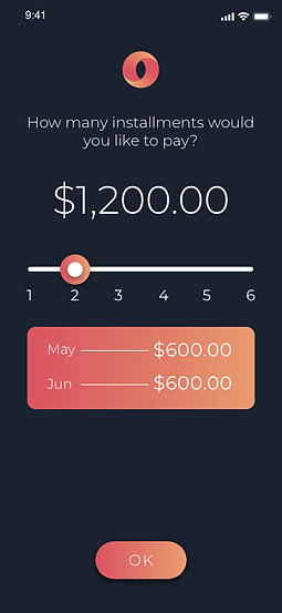
In order to decrease the user’s frustration and the possibility of being overwhelmed with the number of installments and the price they would pay each month, the slide button easily lets the user choose in how many months they’d like to pay, and automatically calculates the amount for each month, so the decision can be made with no frustration.
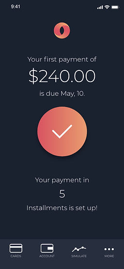
After user testing, the screen with the confirmation message was added, as the results showed a restrain in remembering the installment information. The detailed screen reassures the user of the number of installments, the amount to be paid each month and the date the payment is due.

Pain-Point 2:
To prevent the user from having to keep checking previous months for purchase information, each new month’s statement shows the monthly price of the installment with a small indication of the number of installments still missing. Upon clicking on the purchase, a more detailed screen appears giving the user all the information about the said purchase: Location, total amount, installment amount, and number of installments.


THE CONCLUSION
Because of this project, I learned the importance of drawing an extensive and well-thought-out user-journey map, in order to find possible pain-points and adapt those into the design to improve usability. In addition to the user map, I learned how to conduct user testing to find areas within the app that might cause confusion and distrust, especially this being a banking app. After this experience, I started spending more time on the steps of process and wireframing, before jumping into the design.
